There is good perspective and composition in the drawing. The
drawing has a rule of thirds as the drawing in the foreground is the focal
point. The eye moves from the focal point to the dark tree in the middle ground
and then along the bridge. It then moves along up to the house and then along
the trees. Also there is another line where It moves from the focal point,
along the fence and round the stream and to the bridge. The eye follows the
bend in the stream and it goes to the middle ground. There are layers from the
focal point in the foreground, the bridge in the middle ground and the houses
in the background. This is a 1 hour 30 minute landscape showing natural and architectural
surroundings.
Faisal Hussain - Observational Drawing 2
Tuesday, 7 May 2013
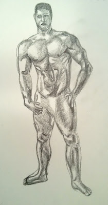
Final Figure Drawing
The figure drawing is a 1 hour study of the male muscular
form. There are many values on the person figure as the light source on the
left is shining on him. There is good perspective and the proportions but the
hands could have been improved. On the upper body there are many different
values because pose as one he is leaning to one side. The muscular structure
can be seen because of the light and dark tones and they also show the
direction the muscles are going in. The shading is shows that the legs and arms
are curved. Also there is some foreshortening the left leg is in front of the
right but there could be an improvement in the right arm as the elbow is bent
backwards.
Final Still Life
This is a 70 min still life drawing. There are a few glass
object and they are reflecting the surroundings and there are overlapping without
any being orphaned. The objects reflect a lot of light and the can also be seen
through. There is good shading on the jug as it can be seen that it is curved
and the shape has many curves. The other glass items also can be seen to be
curved by the shading which adds depth and volume. The marbles in the bowl are
also shaded so they look 3 dimensional and so it adds volume, mass and depth to
the spheres. The cloth has many different values as there is subtle light and
also the light is being reflected around the room. The object also cast a cast
shadow in the background and the focal point is the metal tin which is in the
rule of thirds. There is an implied line going from the tin to the jam jar and
then down to the cast shows. It then travel along the bottom of the cloth and
then up to the jug and bowl. There are also cast shadows being cast on the wall
by other object in the room.
Wednesday, 24 April 2013
Natural Landscapes in Colour
The image is of a small bridge and the river running under
it. It was created using pastels. Looking at the image there have been
different colours used and some of them mixed together such as the shadows in
the water green and blue have been mixed. The bridge has had different colours
and the bridge can be seen clearly because of the layers of colours. Also there
is distinct colour between the tree next to the bridge and the trees in the
background which have several different shades of green. The rule of third can
be applied in the single tree is the focal point and the eye leads you across
the bridge and along the waterline to give you an implied line.
Modern Architecture
This image is a 1 hour drawing of modern architecture. There
is depth and volume in these images as the different values have been used. The
shadows affect the surfaces on these buildings and some of it is subtle light.
The main light source is coming from the right hand side and the values change
on the curved building and get darker as light is being blocked from reaching
the other side. There is also the subtle light that is giving the reflections
in the windows on the curved building. All the buildings are different shape
and these shapes have shadows cast onto them. The curved building is casting a
shadow on the ground. The building in the middle ground is casting a shadow too
but there is a lot of glass which is reflecting a lot of light to. This is a
lot different from interiors as there is less light sources outdoors than in
interiors. There are also different angles as the curved building has a long
curve but the other buildings mostly have straight lines.
Classical Architecture
There is good composition in this interior and it is
different to exteriors because of the lighting. There are more lights indoors
and there is a light in the drawing. There is good composition and perspective because
of the angle of the wall and banister. There is some foreshortening in the drawing
at the window because it is further away. The main focal point is the pillar
which is in the rule of thirds. Line has been used most straight lines and
there are many right angles but nor many curved lines. There are different
types of textures in the drawing from the top of the pillar, the stone wall and
the window. There are many different angles because of the foreshortening. This
was a 35 minute drawing of a classical interior.
Subscribe to:
Comments (Atom)


